Logo development (AC_1,2,3,4) (LO_5,6,8)
- Valentina Nenkova
- Jun 10, 2020
- 1 min read

Logo inspirations;
I am really liking these simple stripped back logos, but yet sophisticated?

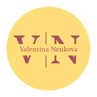
Logo idea 1;
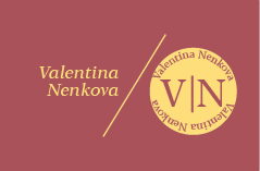
I decided to use the colours from my portfolio and create the logo based on that because I already like how they both link; burgundy and yellow. It also shows a good energy vibe.


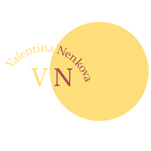
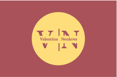
Logo idea 2;
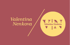
After looking at some more inspirations I decided to be a little more playful. My favourite one is the top left, however I do find the middle bottom quite fun and interesting, but I don't think it would look right on a business card, it's not practical.


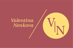
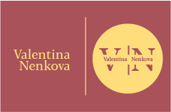
Visualised on business card;
Even if I don't end up creating this brand, it's a good way to update my business card.
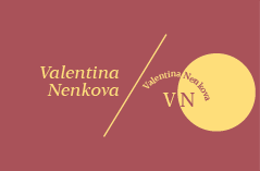
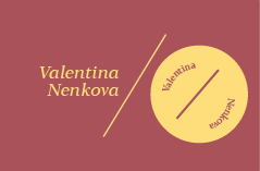
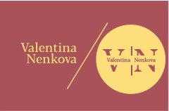
Logo guidelines;
After choosing my logo, I created some guidelines for it to keep it neater.


Feedback;
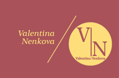
Overall, people choose the one I was hoping for and it makes sense as it the most practical one.


Final;


Comments