D&AD Visual work development (AC_2&6) (LO_5&6)
- May 19, 2020
- 2 min read
Updated: May 21, 2020
From multiple tutors I have gotten the feedback for this project to simplify it and allow it to breath by bringing in the negative space. If you have read my previous posts, you will know that I am not a fan of negative space, however in the finish outcome I do like it. I just need to embrace it when I work with it.
So basically I will be making this project more simple, minimalist and let's say AIRY.
Inspirations;
Percentage;
Visualising Data;
Using objects to visualise data;
Thinking how to visualise words in different way;
Other;
REMINDER;
Problem; The orgasm gap
Insight; Women don't know their bodies.
Idea; Provide women with facts about female wellness in order to spark the conversation online.
THE Original;
It's strange how life works. I actually liked these before, I knew there could be improvements done and where, but I didn't think it was thaaaaaat BAAD. Now I changed my mind. Looking at this now, I am looking everywhere and no where at the same time. This simply means that the audience wouldn't know which bit exactly is the information they need to take in.
THE Before;
After endlessly looking for inspirations to make these 'posters' simpler and full with negative space. I gave myself and my soul to the darkness and I think I like it. I think these turned out pretty good. I do like the simplicity, it gives it room and its short and straight to the point.
THE Process;
In the brief it was an important element that we had to have the 'teen vogue' logo. So I began to experiment ways I can show how the two brands would collaborate.
THE Feedback;
The feedback was relevant and very useful. I think that I should just completely change the percentage with the mouth. It needs to have a clear consistency throughout, the mouth looks like an outsider.
THE After;
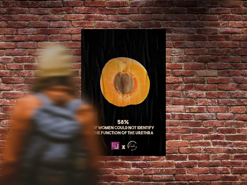
I think they work really well together. The consistency is there. I actually really enjoy the simplicity.
Comparison;
I decided to put the old one and new one next to each other. I have kept the same structure in the sense of visuals, percentage, info, and where to get more information. I think that worked well because it gave a nice flow for the audience to allow them to get attracted to a visual, get information about it and of course if they wanted more where or who to look for. Even the equation itself I literally minimised into less of a ramble. Overall, I am happy with the outcome this far. There is always room for improvement, so I shall do that in the next 1-1.
Extra elements;

Feedback from Rob;
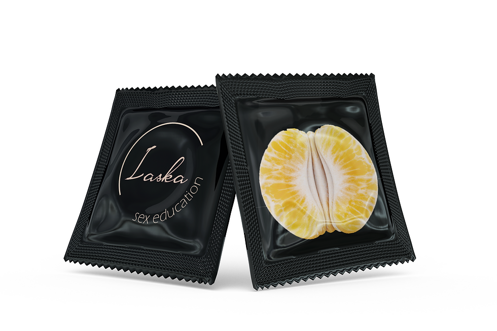
He really liked this. He loved the fact I have used fruits and he told me the 44% and 60% work best because it challenges the viewer to think whether we are talking about the fruit or the private areas. For this reason, I will update the other two versions and update the mock ups.
Before feedback;
After feedback;
I decided to keep the imagery for one of them because it fitted very well with the fact. He spoke about to keep all four posters about how people couldn't identity and keep those words in because it makes it more constant rather than to talk about different facts.


Comments