Poster (LO_1,2,3) (AC_3,4,6)
- Valentina Nenkova

- Apr 14, 2020
- 2 min read
Why Posters?
The idea of the posters is that they will be written in Bulgarian and be placed around the city. Once I found a Bulgarian ad outside Odeon in Greenwich and it made me feel very warm and happy to see such a small country somehow made its way to the big UK. I was thinking the posters to be influenced by the logo. I have asked some of my Bulgarian friends who live in the UK and they said they would stop and read/look at the poster. I would be able to experiment and try to create a QR code which will allow it to link to the digital world.
Inspiration;
These are some of my inspirations. I really enjoy the simplicity and how clean they look, those are the elements that I will be applying to my posters.


Design 1;
I started off by taking the logo and enlarging it. It looks quite simple, not that anything is wrong with that. I personally, don't like the font at the bottom and how its situated. I like the contrast and how the sun and the type of Bulgaria have layered together. I think that is quite effective.

Design 2;
Here I started playing around with the space and thinking where to position it better. I am not a fan of this. I prefer the top half of this poster.

Design 3;
I like the flow of this poster. It's very easy to follow and its simple to understand especially with the strapline. The only thing I am not comfortable with is the negative space around it. I know it allows the poster to breath, but I am not sure.

Design 4;
This one is for definite my favourite. I moved around the sun and tried to create three layers of sun, mountain and the sea. I think it works better. The copy is also in three layers. These elements are influenced by the Bulgarian flag. I also decided to do the copy in the same order of the colours. I think it breaks the colour palette more and it literally allows it to represent the structure of the flag.

Feedback;


After all the posters will be in Bulgaria, I need to make sure I am consistent with play out. I translated the copy and one thing that was difficult is that not all the fonts would work on this alphabet so, I was quite limited. These are the three designs that worked best and closest to the English version.
Bulgarian Design 1;
This flows quite nicely. The copy is easily read and it's easy for the eye to understand.

Bulgarian Design 2;
This is quite old school style in Bulgaria anyway. I don't think the two fonts link that well. I think they clash a little.

Bulgarian Design 3;
I do like this, but I also don't. It is difficult to be read, but It kind of looks good. Technically in the real world it wouldn't work, so I think this one is out.

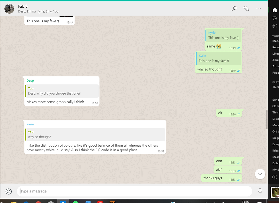
Feedback;

Overall;
I think this was a very successful day. The next thing I have to do is go back to the video and develop them a little further, now that I had a break from them. I will be asking some of the lecturers for feedback. Sometimes I feel quite stuck and need a push in the right direction.


Comments